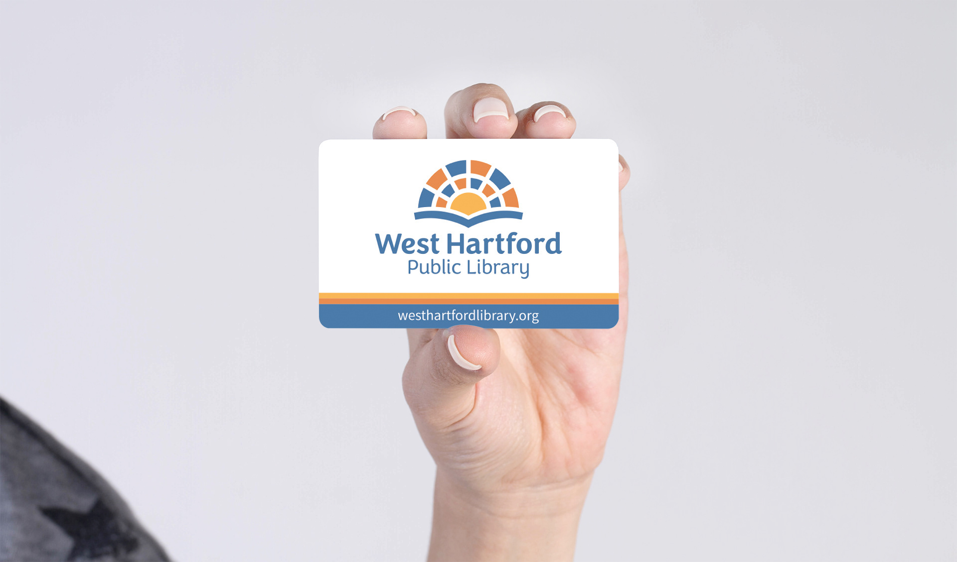
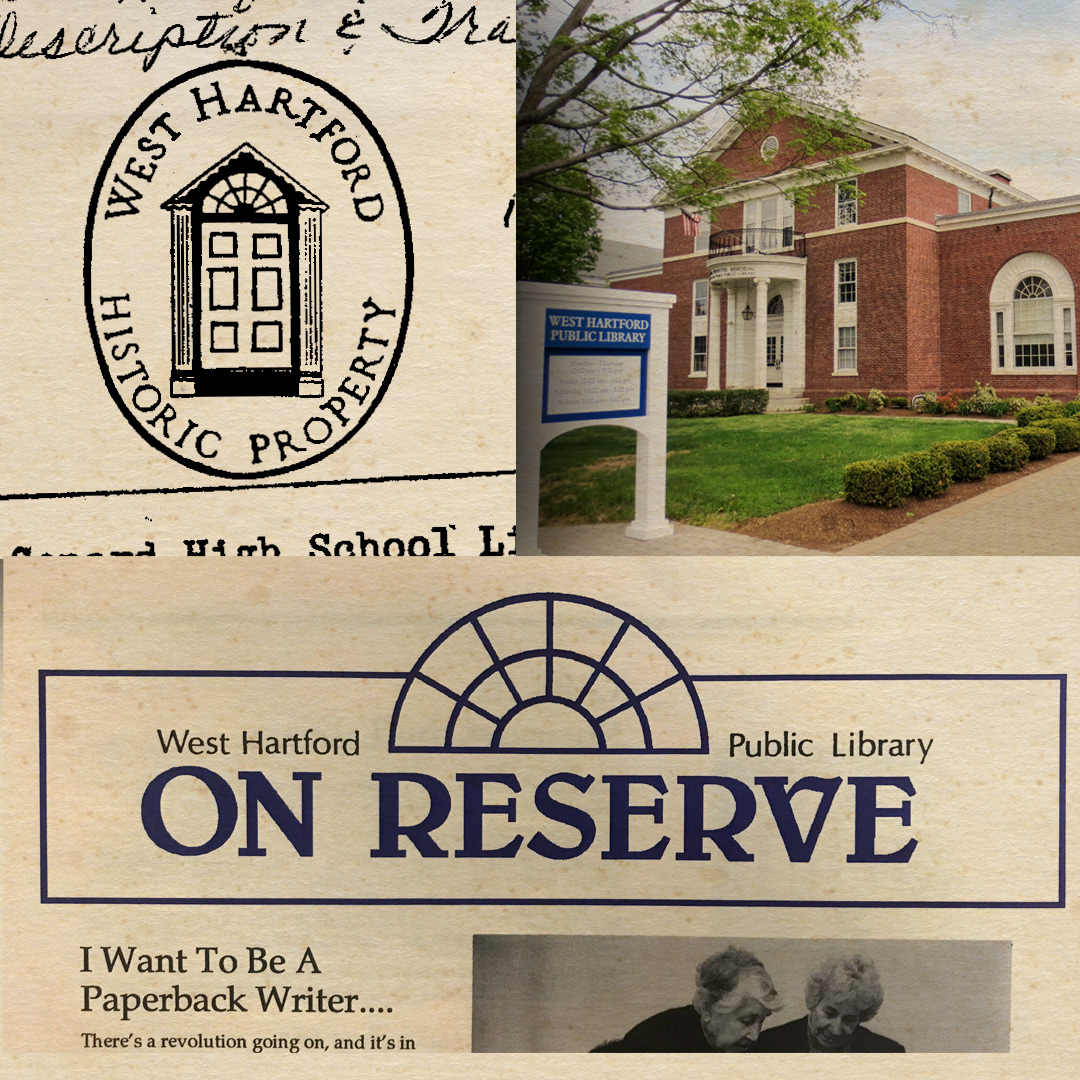
I designed a rebrand for West Hartford Public Library in 2020. The new branding is bright, simple, clear and modern — and the first rebrand for the library in decades. The logo is a nod to the library's past, incorporating the style of windows that have been part of its structure and visual identity for more than 100 years, while simultaneously looking ahead to a bright future with a clean design that symbolizes its dedication to literacy. The three colors represent its three locations that work together to strengthen the diverse West Hartford community. In my initial research for a new logo, I dug through a ton of old library materials and newsletters, going back decades. I kept coming back to these windows. They were depicted in newsletters in the 70s and 80s, and on stamps decades before that. Then one of the librarians at WHPL said to me, "Oh, these windows were so important to the founders of the library that when we moved locations over 100 years ago, they actually moved the windows, too." So that was that. I built out the brand to make it cheerful and fun, something that the children's department can utilize just as well as the local history room!