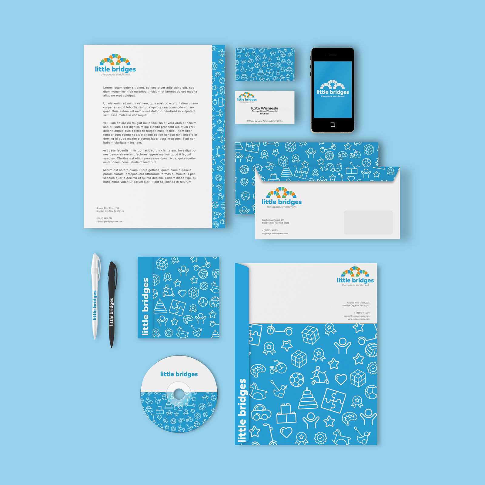
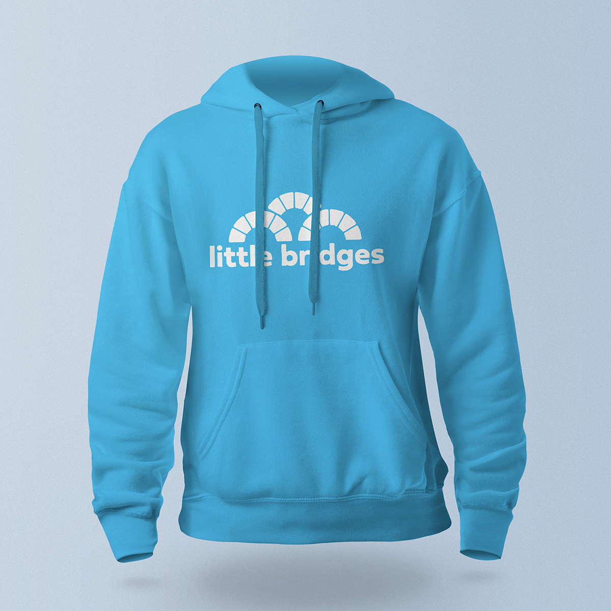
In 2020, I created the branding for a clinic in Portsmouth, NH that specializes in helping children and families with occupational therapy, physical therapy and speech pathology. While Portsmouth has a few fantastic actual bridges, we decided to go with the look of a bridge that a child could build using blocks. The colors are similar to what's used in a lot of children's toys. They are bright and fun. The logo needed to match the fun and exciting environment the therapists are trying to create for the children and families in Portsmouth. I think this logo, as well as the accompanying icons and brand colors, accomplishes that. The lowercase and rounded customized typeface provides a sturdy platform for the bridge. This is one of my favorite logos and I'm proud of it, especially how well it works in solid white on a color background (see that hoodie below.)