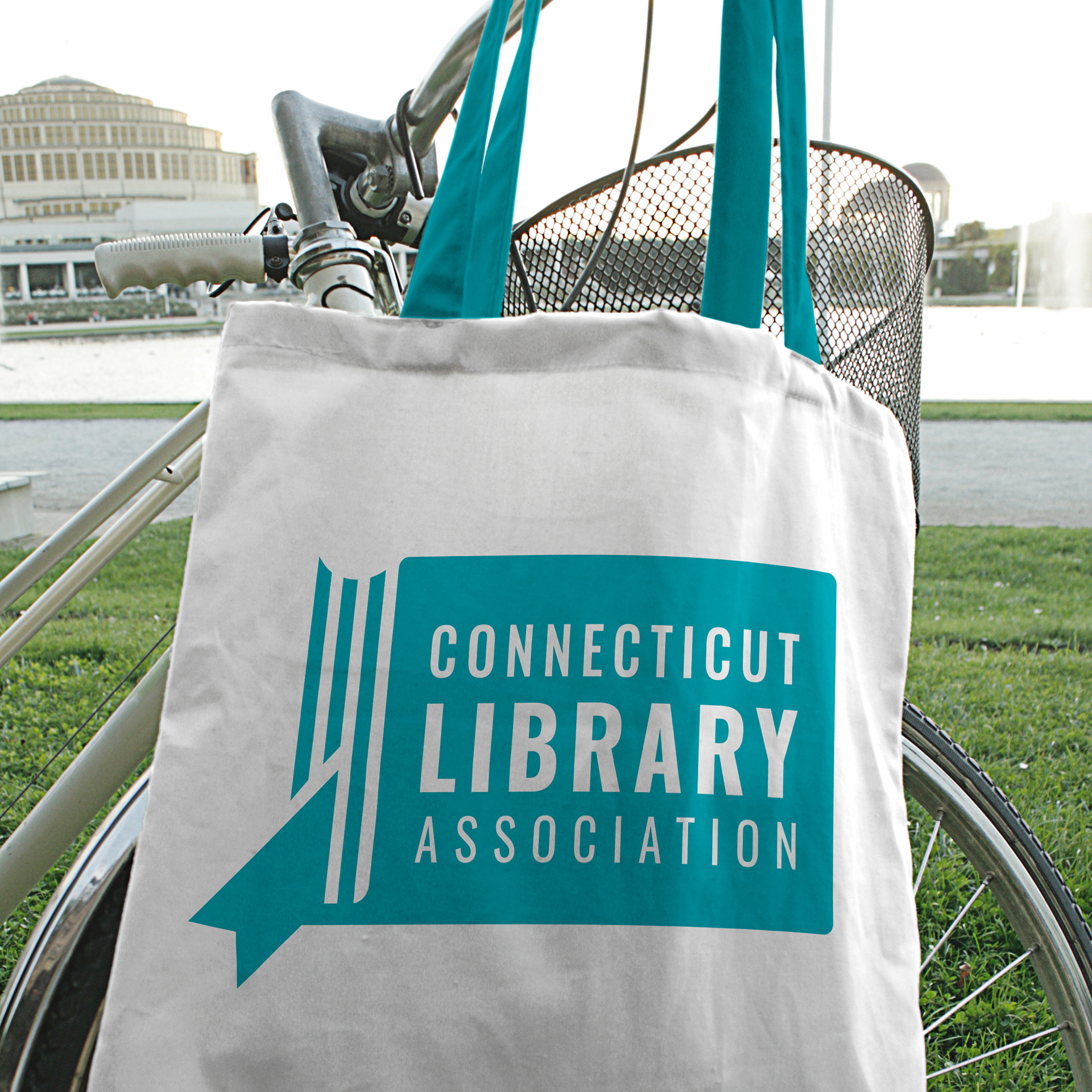
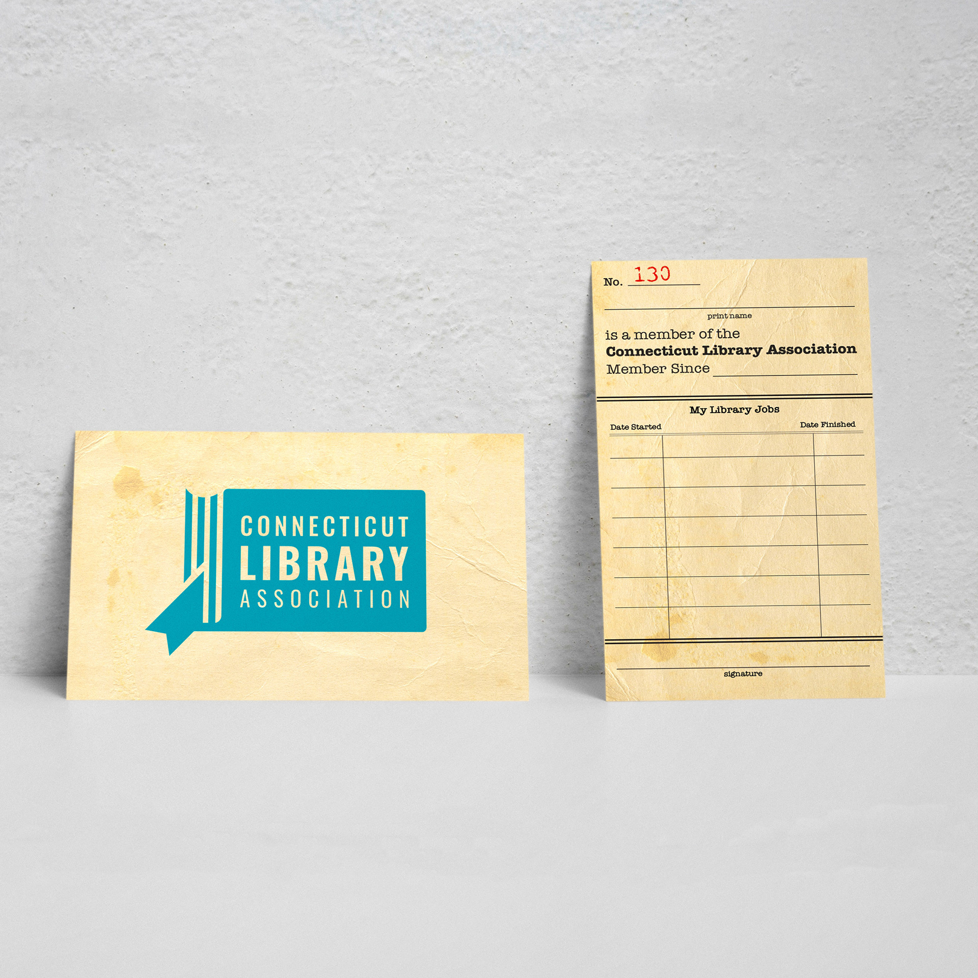
I updated the branding for the Connecticut Library Association in 2020 with a new logo and the first ever brand guide in the organization's 125-year history. The shape of Connecticut is boring. I know. It's a rectangle and a square hanging off of it (I'm aware, check out my fake brewery). That's why with this logo, I tried to make it look more like a book rather than the state shape of Connecticut. I find so many state shape logos try too hard to make the state shape fit their illustration and the overall meaning is completely lost. If someone just sees a book, great! If someone sees a book AND sees the shape of Connecticut, I've won. Sorry, not sorry for cutting you off in the bookmark Greenwich.
The type is simple and easy easy to read. It works well in any color. I also helped shorten the organization's motto to the very true: "Leading the Way Since 1875."


